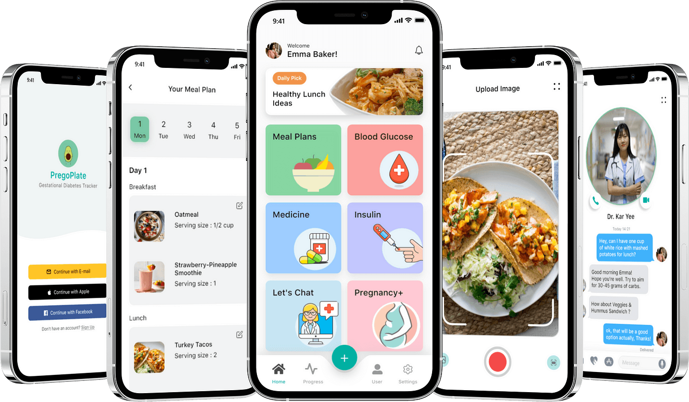
FitMeals: Meal Planning Made Simple
May 2025 — Jun 2025, Sole designer
Introduction
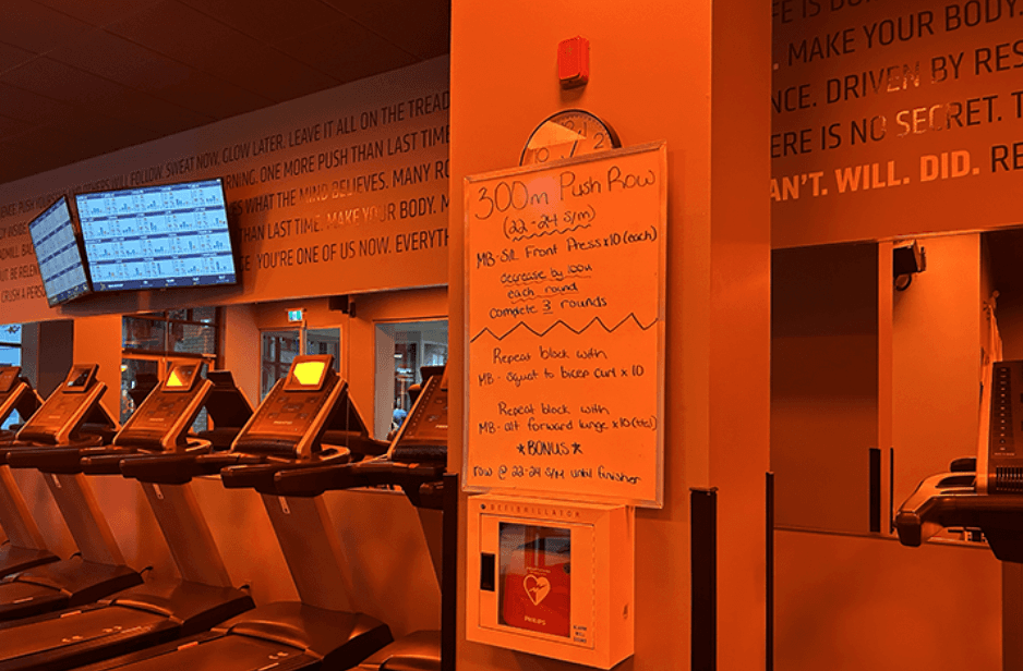
Everyone is hungry
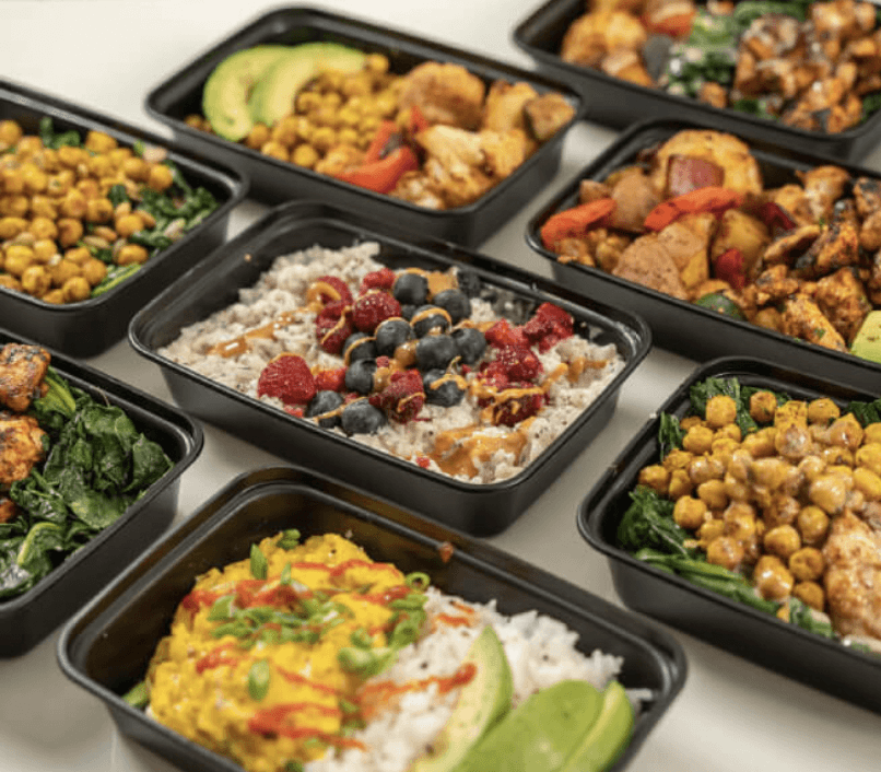
It’s dinnertime, your fridge is full, and yet you’re still wondering what to make. That’s where FitMeals steps in. Designed for busy people who want to eat well without the daily decision fatigue, FitMeals curates personalized meal options based on your dietary preferences and the ingredients you already have at home. Whether you're trying to hit your nutrition goals, reduce food waste, or simply make cooking easier, FitMeals helps you turn what you have into meals you’ll love.
When tasked with creating an end-to-end application, I chose to focus on health and wellness—an area many people struggle with in their busy lives. Through user research, I discovered that people often feel unmotivated to exercise and overwhelmed by the effort it takes to find and prepare healthy meals.
This led to the idea for FitMeals: an app that curates personalized meal suggestions based on user preferences and what they already have at home—making healthy eating easier, faster, and more sustainable.
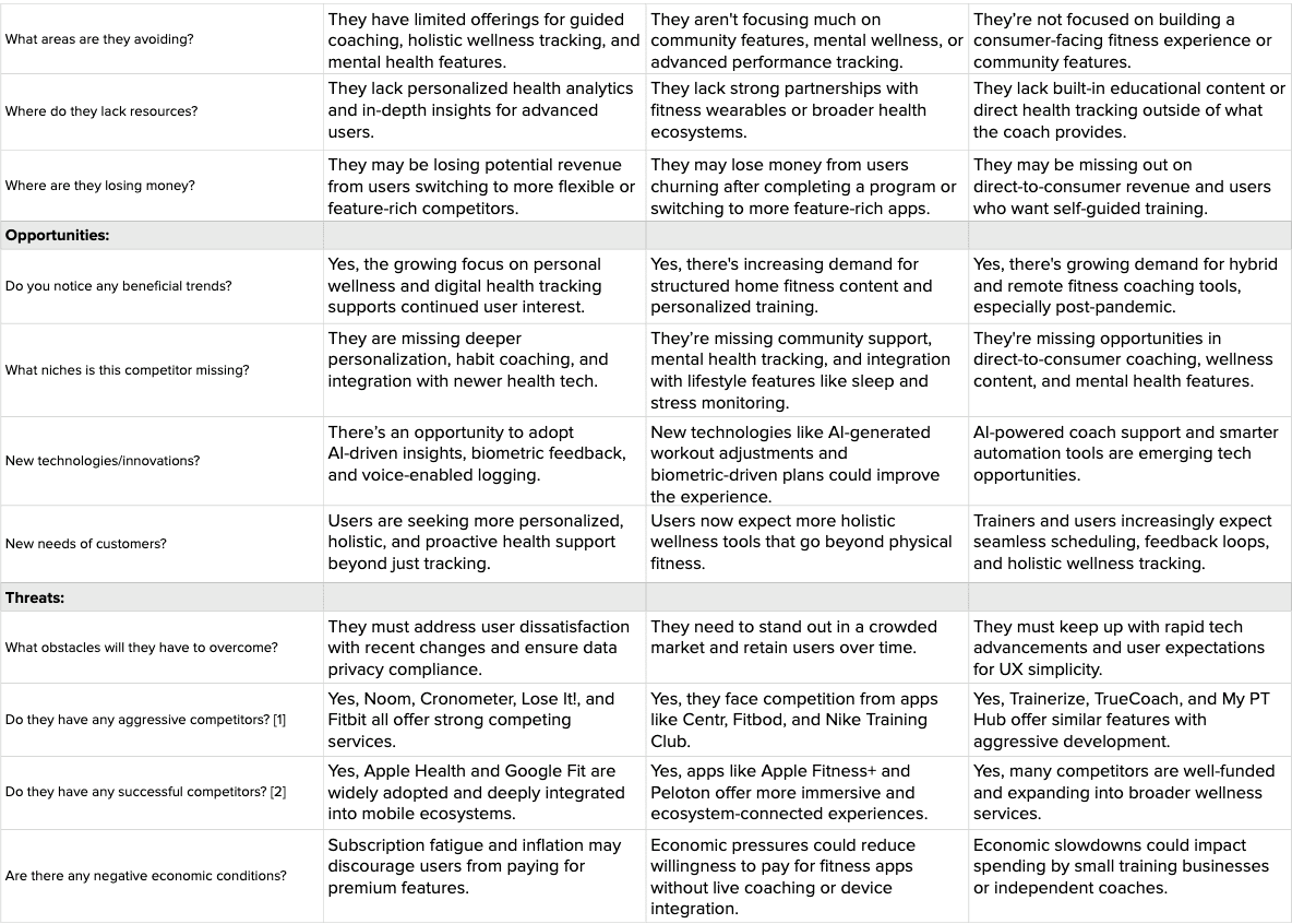
Be the best
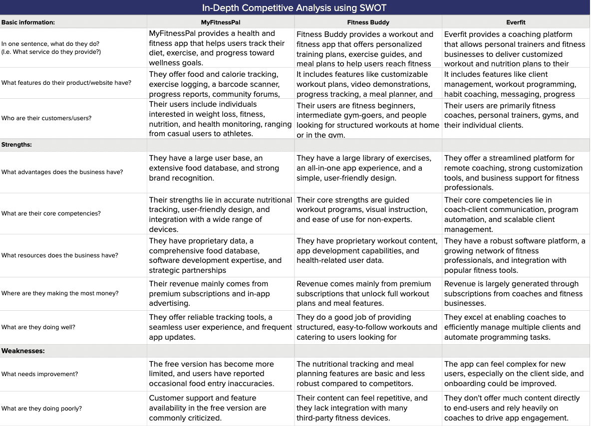
To better understand the landscape and design a product that truly stands out, I conducted a SWOT analysis on key competitors in the meal-planning space. This helped me identify not just what similar apps were doing well—like sleek interfaces or large recipe databases—but also where they fell short, such as lack of personalization or limited integration with pantry items.
By pinpointing these strengths, weaknesses, opportunities, and threats early on, I was able to shape FitMeals with a clearer vision: focusing on smarter, personalized meal planning that fits seamlessly into users’ daily routines.
The importance of user insights
Who is at the center of all this?
Putting the features on paper
Putting the features on paper
Going with the user flow
Starting off small
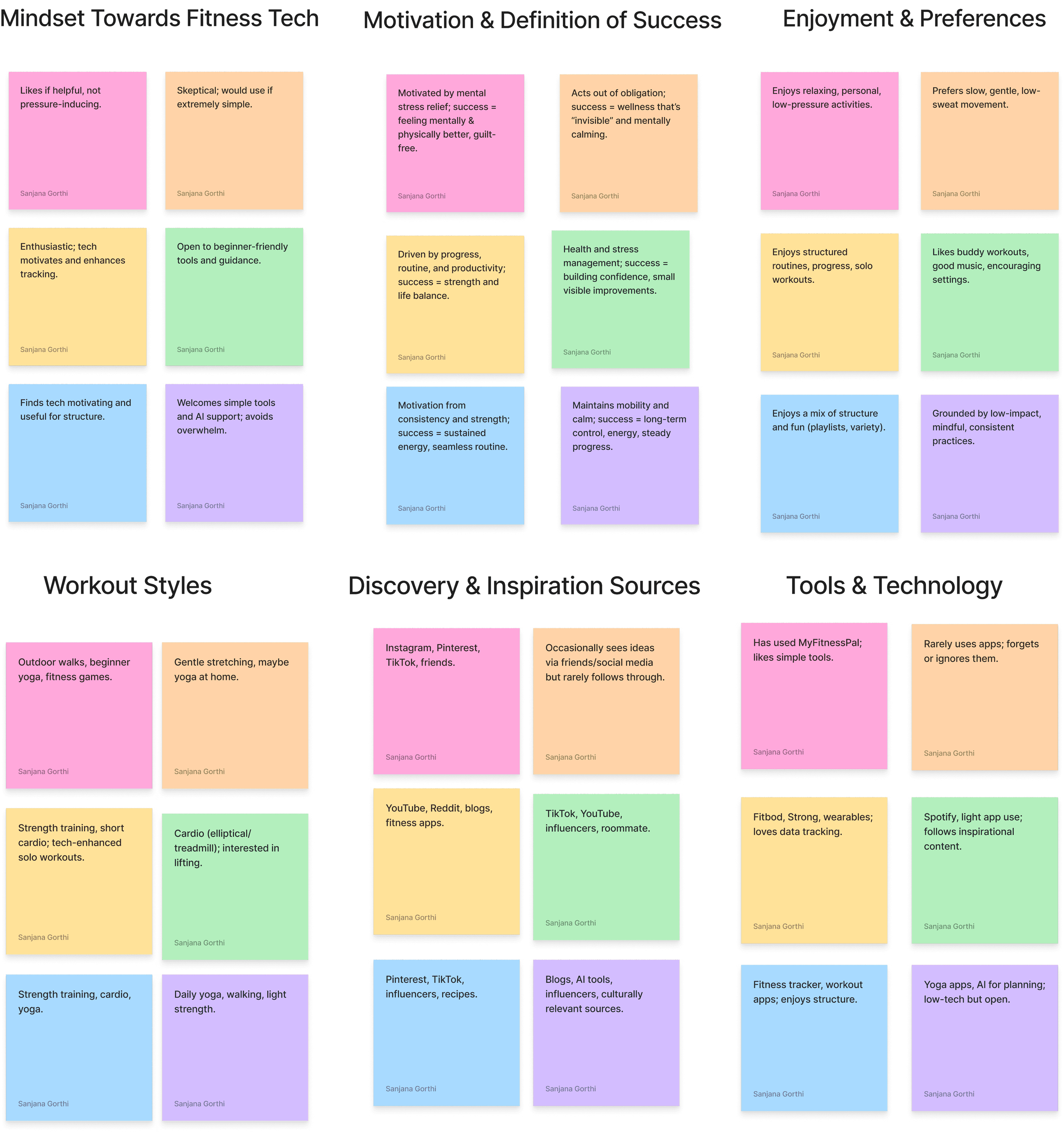
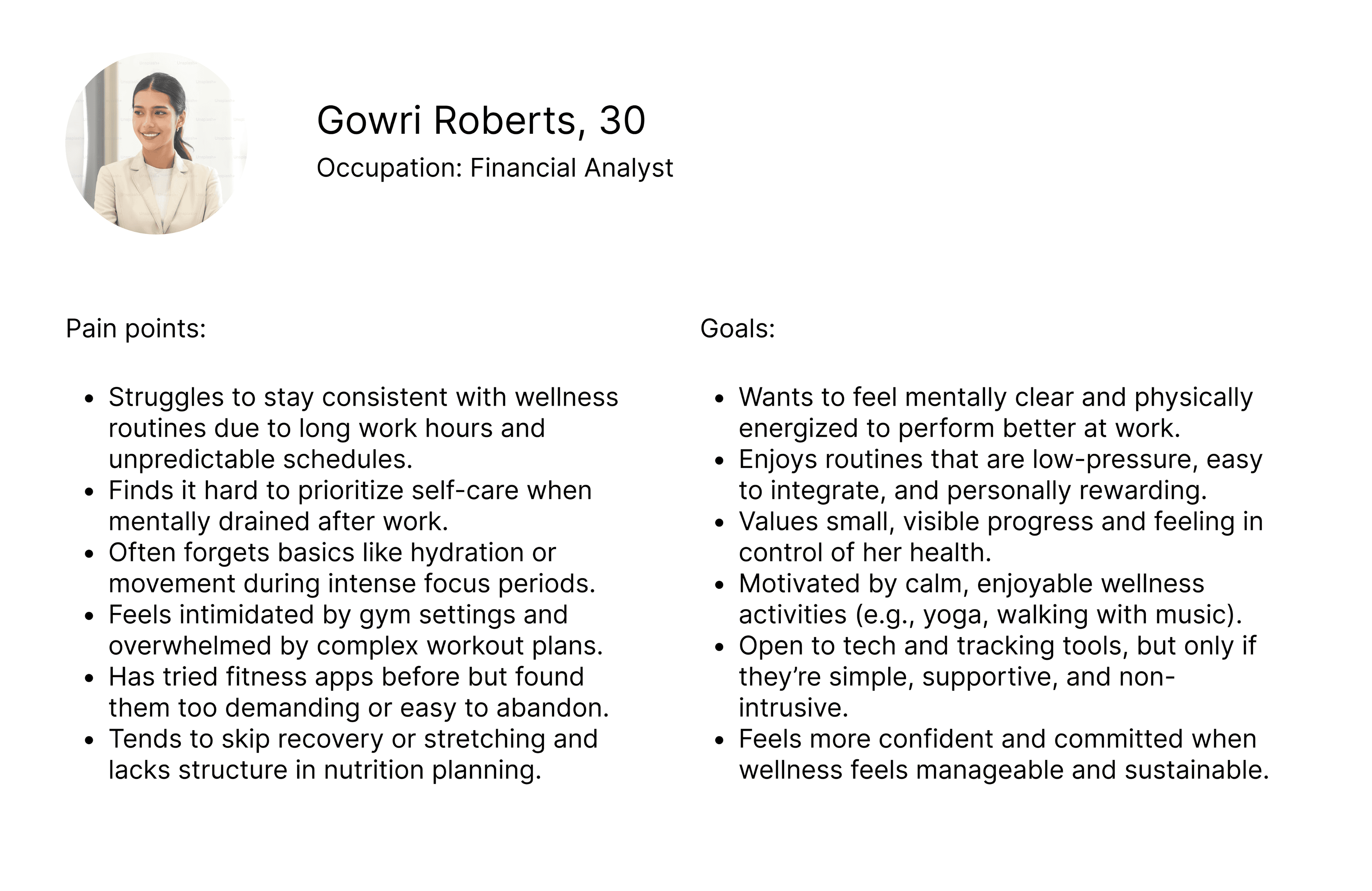
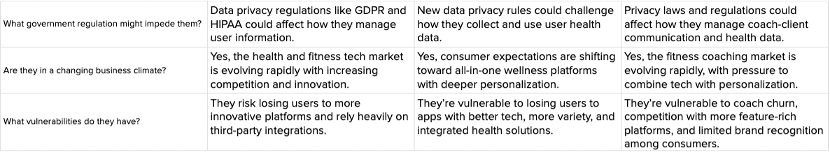
After interviewing avid Instagram users, I used affinity mapping to organize the feedback and uncover key patterns. Common themes like frustration with feed clutter and a desire for more control stood out. These insights helped me shape clear user personas, giving me a focused understanding of who I was designing for and what they needed most.
Consolidating the information from the affinity map was one of the more challenging parts of the process. With so many sticky notes full of individual thoughts and responses, it was easy to get lost in the noise. But I realized that simply collecting data isn't enough—what really matters is being able to distill it into something meaningful.
By pushing through that messy middle and looking for recurring themes, I was able to uncover key user needs and behaviors that directly shaped the user persona. This step was crucial in shifting from broad research to a focused understanding of who we’re designing for and what problems we need to solve.
Once I had a clear understanding of my users, I began defining the feature set by categorizing ideas into four buckets: must-haves, nice-to-haves, surprising & delightful, and can come later. This framework helped me prioritize with intention—focusing first on features that directly addressed core user needs, like personalized meal suggestions and pantry-based planning.
By breaking things down this way, I avoided feature overload and stayed grounded in what mattered most for the initial design. It gave me clarity and structure, allowing room for creativity while keeping the user experience at the center.
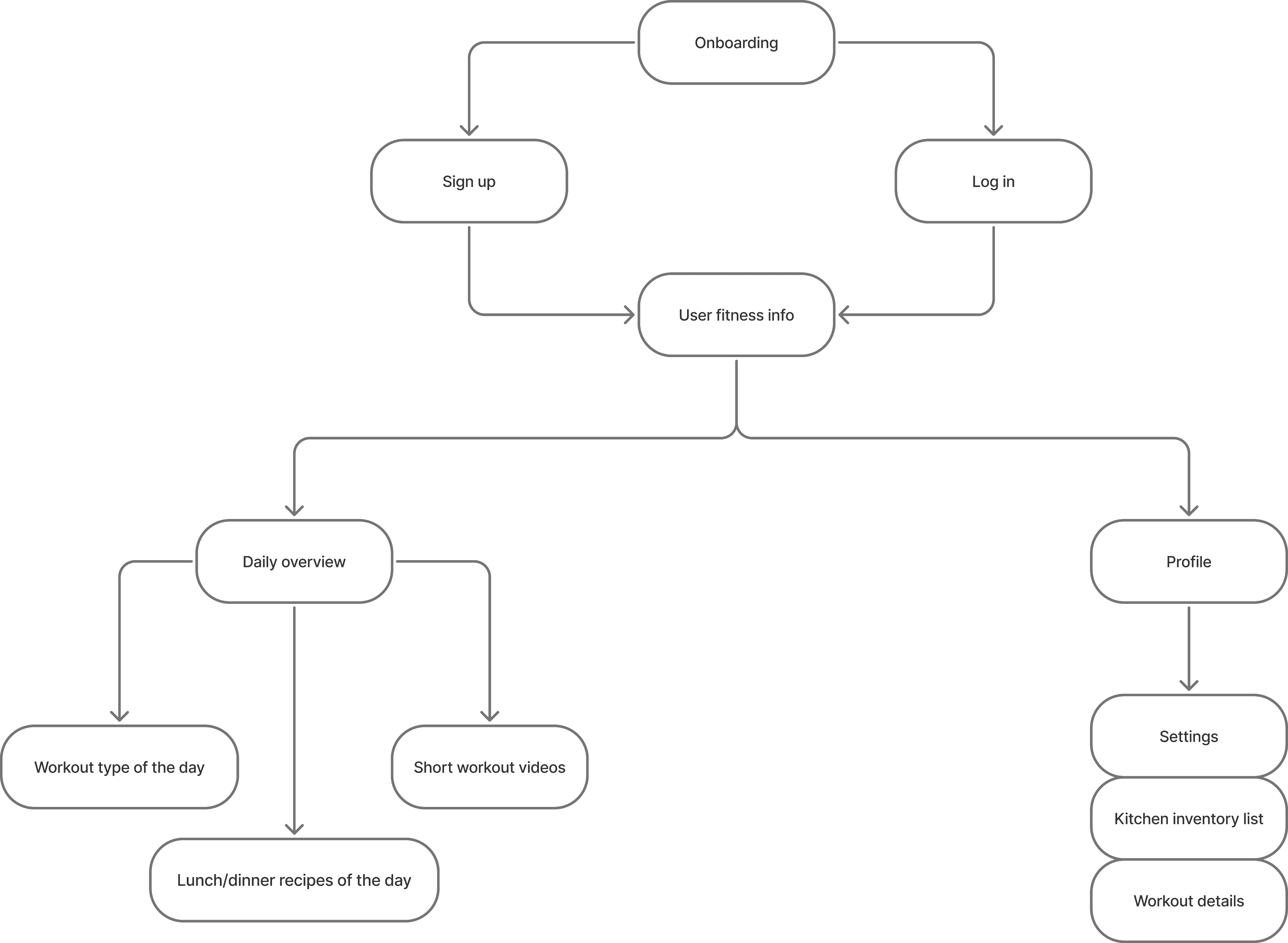
As I moved into defining the structure of FitMeals, I realized that having great features wasn’t enough—they needed to be organized in a way that made sense to users. That’s where the sitemap came in.
Creating the sitemap was like building the blueprint of the app. It helped me visualize how each screen would connect, how users would move through the experience, and where key features would live. Without it, the app risked feeling confusing or cluttered.
This step was crucial in ensuring that the final design would be intuitive, efficient, and aligned with how users naturally think and navigate. It laid the foundation for a seamless user journey.
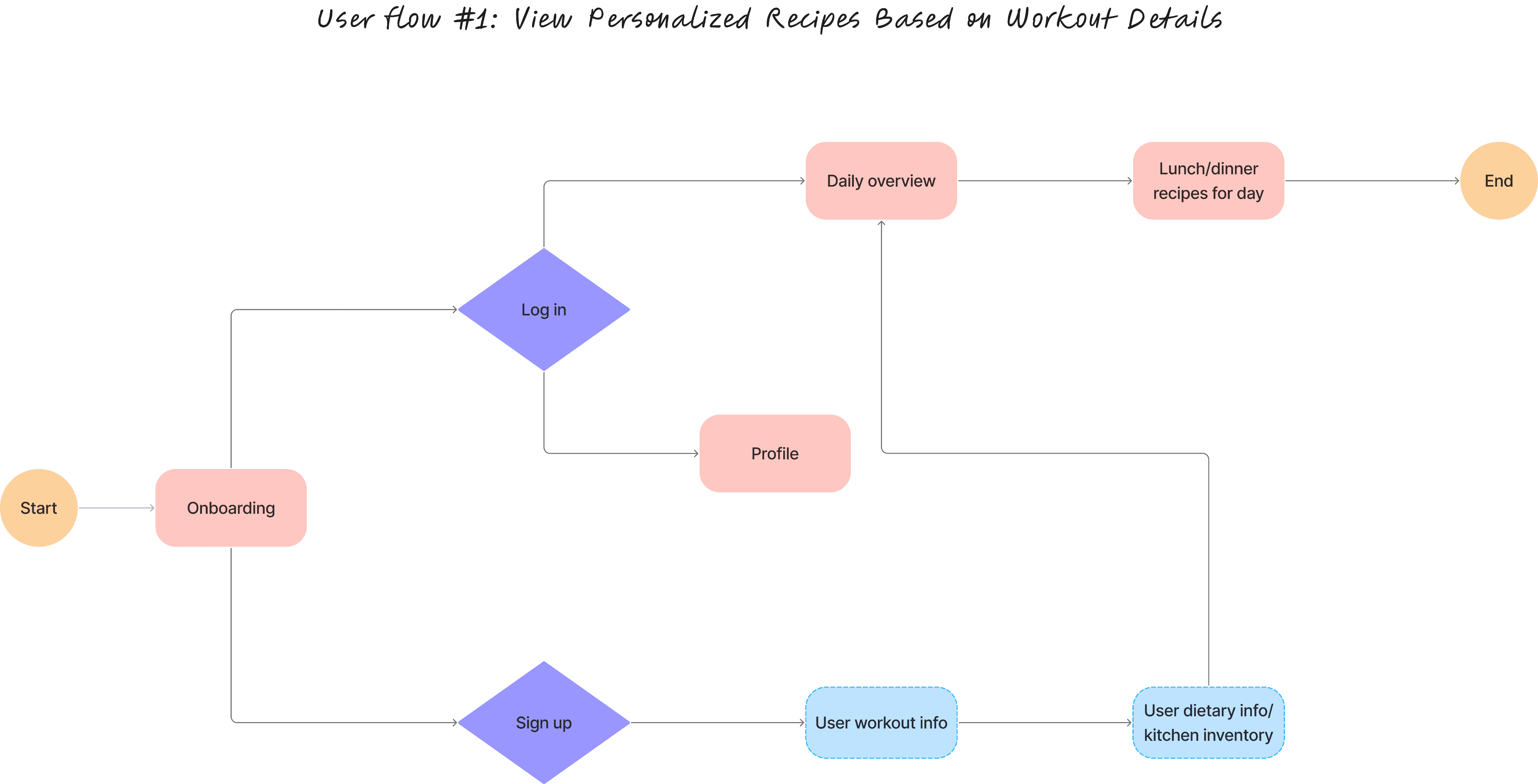
With the sitemap in place, I had a clear structure for the app—but I still needed to map out how users would actually interact with it. That’s where the user flow came in.
While the sitemap showed the big picture, the user flow zoomed in on specific tasks, like finding a meal based on pantry items or saving a recipe. It helped me think through each step a user would take, anticipate pain points, and ensure the journey felt smooth and logical.
Creating the user flow was essential to designing an experience that not only worked on paper but also felt natural and effortless in action.
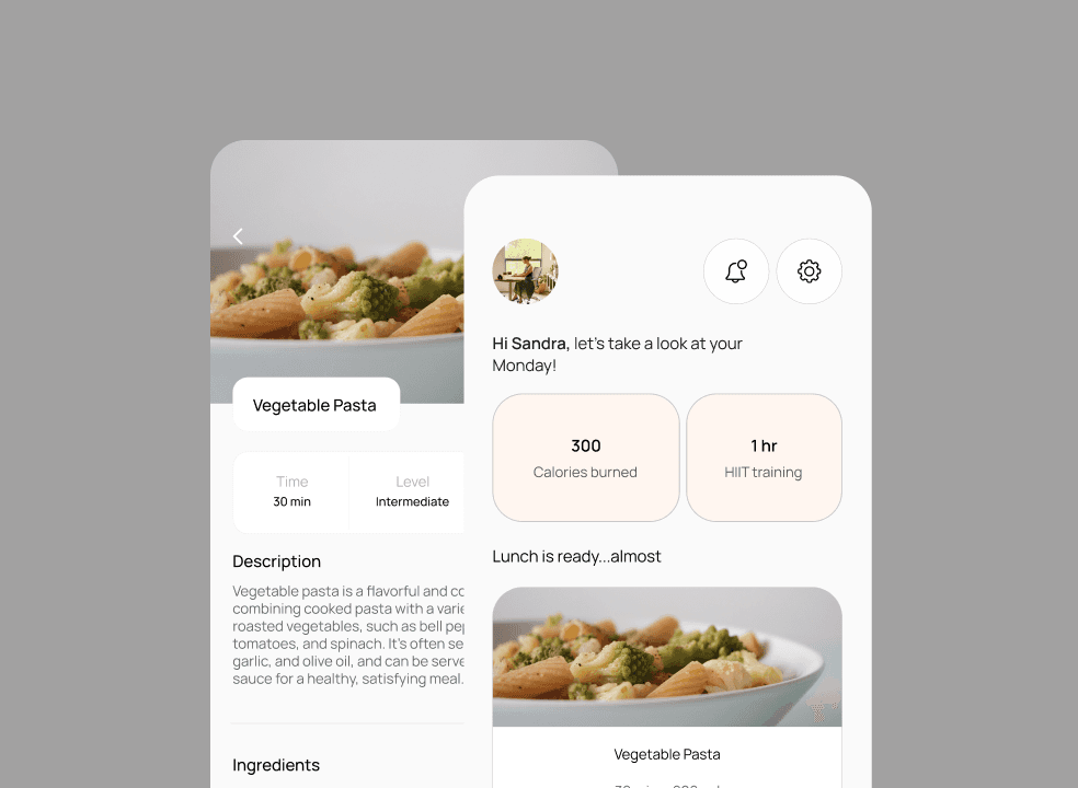
With the user flow mapped out, I had a clear sense of how users would navigate through key tasks—but I needed to start translating that flow into visual form. That’s where low-fidelity wireframes came in.
These early sketches allowed me to quickly test layout ideas, explore different screen structures, and focus on usability without getting caught up in visuals. It was a crucial step in making sure the core functionality made sense before moving on to higher-fidelity design.
Must Have
Daily low-effort wellness check-ins
Beginner-friendly workout and habit library with options like stretching, walking, yoga, and low-pressure cardio
Simple progress tracking dashboard
Option for meal ideas based on what is readily available to the user
Nice to Have
Mood-based recommendations
Gentle reminders and motivational nudges that feel supportive, not nagging
Option to personalize wellness goals
Surprising & Delightful
Ambient audio or music integrations with wellness activities
“Celebrate Small Wins” highlights progress such as “3 days hydrated!”
Can Come Later
Smart schedule syncing to suggest wellness breaks based on calendar patterns
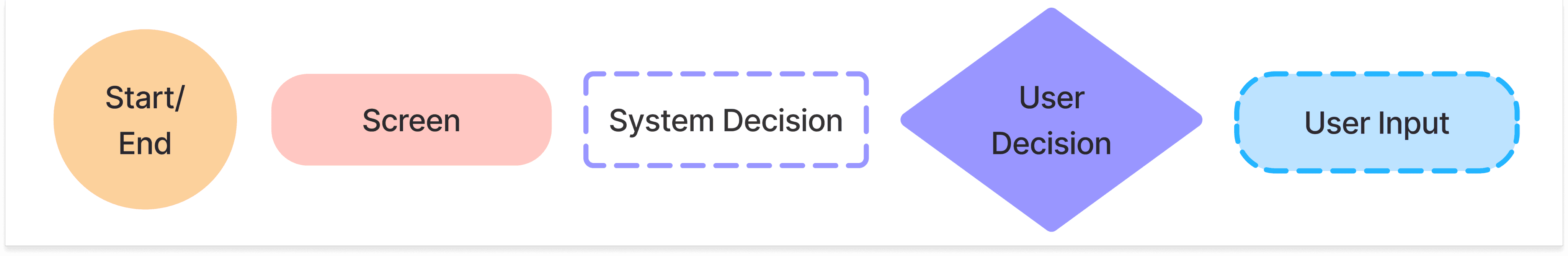
Legend
What’s the product without a brand?
Logo it up
Once the structure and flow were solidified, it was time to bring the visual identity of FitMeals to life. I started by crafting a mood board, style tile, and logo—laying the foundation for the app’s branding.
This part of the process helped define the look and feel of FitMeals: clean, approachable, and energizing—reflecting the app’s goal of making healthy eating feel simple and doable.
These visual elements weren't just decorative—they served as a guide throughout the design process. When it came time to create the high-fidelity mockups, having a strong brand direction ensured consistency in color, typography, and tone, helping the final product feel polished and cohesive.
Designing a logo takes more than just creativity—it requires a deep understanding of the brand’s personality, purpose, and audience. For FitMeals, I focused on creating a logo that felt fresh, modern, and health-focused, while remaining simple enough to be instantly recognizable. It involved iterating through sketches, refining concepts, and ensuring the final mark worked well across different sizes and platforms.
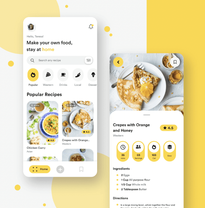
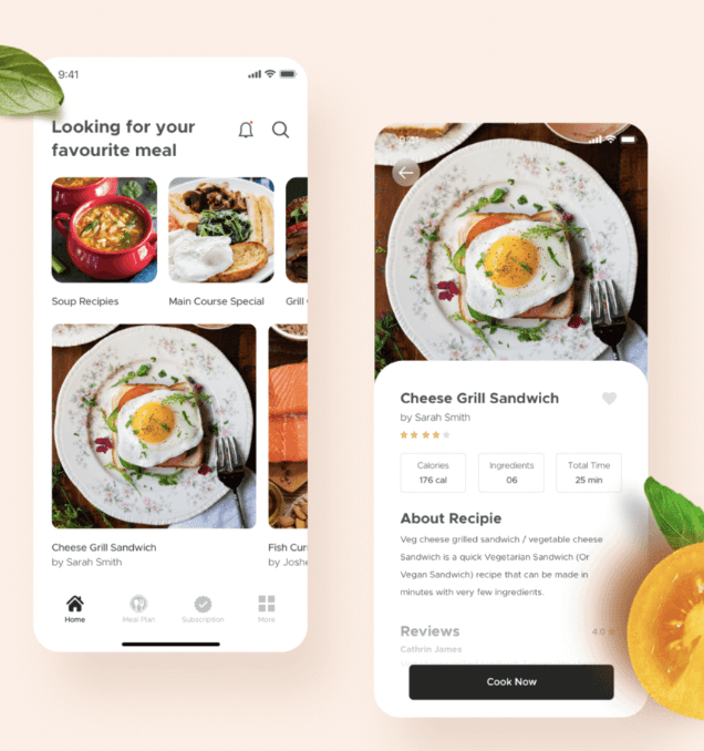
Inspiration
Core values
Empowerment – Help users take control of their nutrition to fuel their fitness journey with confidence.
Precision – Deliver scientifically backed, calorie-accurate meal plans based on real workout data.
Trust – Commit to transparency in ingredients, macros, and sourcing for user peace of mind.
Sustainability – Promote habits and meals that support long-term health and fitness, not just short-term results.
Adaptability – Evolve with the user's lifestyle, training goals, and dietary needs for ongoing relevance.
Product name: FitMeals
Mood board
Manrope 14 px
Header 18 px
Manrope 18 px
Subheader 16 px
Manrope 16 px
Body 14 px
Manrope 14 px
XX
30 min • 200 cal
View recipe
XX
Calories burned
Cards
Buttons
Sign up
Sign up
Style tile
Just a few finishing touches
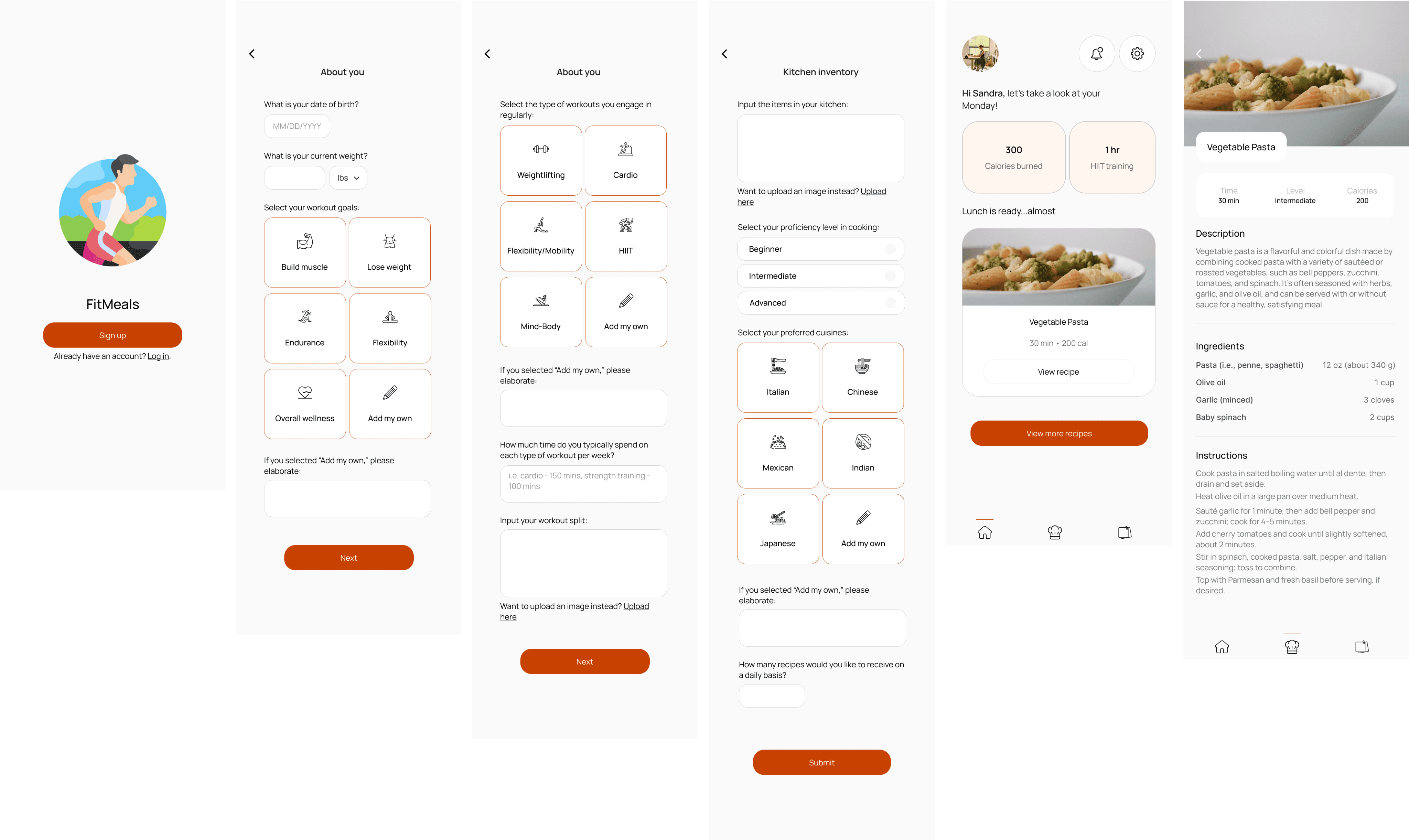
Transitioning from low- to high-fidelity wireframes was all about bringing the experience to life visually. I transformed basic form-heavy screens into more engaging, intuitive layouts by incorporating icons and imagery—especially in the input pages—to make entering information feel quicker and more enjoyable. This shift not only improved usability but also gave the app a more polished and approachable feel. I shared these high-fidelity mockups with users to gather feedback, which helped me fine-tune elements like spacing, visual hierarchy, and navigation flow.
Insights from usability testing
Reusable elements for a seamless experience
Users interpreted key features—like the “View More Recipes” button—accurately, expecting it to show additional personalized meals. Feedback suggested small improvements to onboarding, such as adding a unit selector for weight and using date of birth instead of current age for automatic updates. A common usability issue was the lack of navigation to go back to previous screens. Overall, participants rated their experience highly (mostly 4–5) and all said they would recommend FitMeals to others.
As the final step in the design process, I created a UI kit to keep all key visual elements organized and easily accessible. This included components like buttons, icons, form fields, typography styles, and color palettes used throughout FitMeals. Having a UI kit ensures consistency across the app and makes it easy to maintain or scale the design in the future—whether handing it off to developers or iterating on new features.
Header 18 px
Typography
Cards
Color palette
Subheader 16 px
Body 14 px
C74200
512400
00000
F8F8F8
F1F1F1
FE864A
FABA9A
FFE5D8
XX
Calories burned
XX
XX
30 min • 200 cal
View recipe
Time
Level
Calories
30 min
Intermediate
200
Manrope 14 px
Buttons
Icons
Input fields
Font
Manrope 18 px
Manrope 16 px
Manrope 14 px
Sign up
Sign up
Beginner
Intermediate
Advanced
lbs


Prototype
Next steps
In conclusion, designing FitMeals was a rewarding process that allowed me to turn user insights into a focused, functional, and visually engaging solution. While the current design meets core user needs, I’m excited about the opportunity to take it even further—by testing new iterations with users and refining the experience based on real feedback. I’m also interested in incorporating accessibility features to ensure the app is inclusive and usable for everyone, making FitMeals not just helpful, but truly accessible to all.